 Tradingview
Tradingview overlays crypto pairs to compare their relative price changes
Tradingview lets you overlay crypto pairs with its Compare tool and read their relative price changes on a shared percentage scale. Each series measures movement over the visible chart period. Comparable market definitions and matching dates make that view useful; separate regular price scales answer a different question about quoted prices.
Compare separates relative movement from quoted prices
Two or more symbols can share a chart through Compare, making their price paths visible along the same timeline.
The Compare or Add symbol button adds a series without replacing the primary symbol. Opening another market as the main symbol would change the chart's subject. The labels distinguish the added series from the chart's primary market.
A common percentage scale
The shared percentage view puts price changes into comparable units even when the pairs have very different quoted prices. It answers which series rose or fell further relative to its starting value. On a non-inverted shared scale, a higher line represents a larger cumulative percentage change within that view, rather than a more expensive crypto asset.
Separate scales or panes
Putting each series on its own regular price scale preserves its quoted values while keeping both in the same chart area. Vertical positions then depend on different axes, so crossings don't establish equal performance. A separate pane gives a series its own display area. These arrangements suit price-level inspection when a shared percentage comparison isn't the main task.
Market definitions belong beside the overlay
The identity of each market determines what an overlay compares, even when the pair names look closely related.
Underlying asset and market type
Spot markets quote crypto assets, while derivatives markets quote contracts whose prices can differ from the underlying asset's spot price. Combining those series can examine that relationship. Calling them interchangeable measurements would hide the product difference. The market description and venue identify which relationship the chart actually shows.
Quote asset and feed construction
A shared quote asset expresses both prices in the same pricing unit. Different quote assets introduce their own movements into the comparison. Percentage normalization doesn't remove that influence. Some crypto symbols also represent synthetic prices calculated from other feeds when a venue doesn't supply that quote. Their presence on a chart doesn't establish a directly traded pair at the named venue.
The visible window sets the percentage baseline
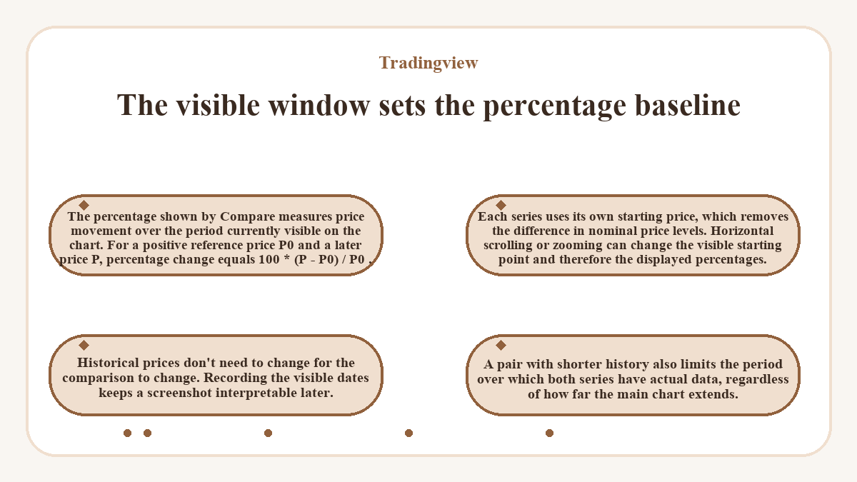
The percentage shown by Compare measures price movement over the period currently visible on the chart.
For a positive reference price P0 and a later price P, percentage change equals 100 * (P - P0) / P0. Each series uses its own starting price, which removes the difference in nominal price levels.
Horizontal scrolling or zooming can change the visible starting point and therefore the displayed percentages. Historical prices don't need to change for the comparison to change. Recording the visible dates keeps a screenshot interpretable later. A pair with shorter history also limits the period over which both series have actual data, regardless of how far the main chart extends.
Line sources and bar intervals change the comparison
A line chart connects one selected price value from each bar, with closing prices as its default source. Open, high and low are other available sources. The source specifies which value enters the line. Comparing one series' highs with another's closes would mix different measurements, even if both use the same percentage scale.
The bar interval determines the span that each value summarizes. Longer bars can hide movements within that span, while shorter bars reveal more of the path. Keep the interval and price source consistent when assessing relative movement. An unfinished bar's value can still move; an endpoint drawn from that bar isn't a settled closing value.
The same prices support two different display choices
Suppose you want to compare two crypto pairs over matching dates and confirm the display using their underlying prices. Check that both series cover the chosen period and that their displayed changes match the price calculations, regardless of which pair performed better.
For this hypothetical example, assume matching closing-price data and an interface that offers both shared percentage and separate price scales. The primary pair starts at 173 quote units per base unit and ends at 181.65. The comparison pair starts at 283 of its own quote units per base unit and ends at 274.51.
Add the pair to the shared percentage scale
Adding the comparison on the common percentage scale yields a 5% rise for the primary pair and a 3% fall for the comparison pair. The calculations are 100 * (181.65 - 173) / 173 and 100 * (274.51 - 283) / 283. Their endpoint changes differ by 8 percentage points. That difference describes relative price movement across the selected period.
Display each series on its own regular price scale
Using separate price scales with both set to regular mode retains endpoint quotes of 181.65 and 274.51 for the same series and dates. The prices, coverage and calculation inputs haven't changed. Each axis now uses its series' pricing units, so line height alone can't confirm the percentage difference.
The displayed series names, date coverage and scale units distinguish the completed setups. Matching the endpoint calculations confirms the percentage view independently of the lines' appearance. If the interface lacks the separate-scale option, that second display isn't available in that configuration. Moving the starting date or changing a source price changes the calculated comparison.
Indexed to 100 changes the display baseline
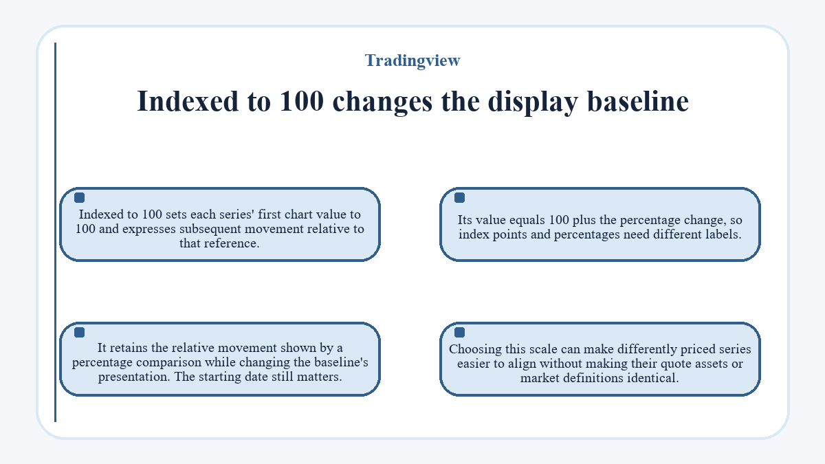
Indexed to 100 sets each series' first chart value to 100 and expresses subsequent movement relative to that reference. Its value equals 100 plus the percentage change, so index points and percentages need different labels. It retains the relative movement shown by a percentage comparison while changing the baseline's presentation. The starting date still matters. Choosing this scale can make differently priced series easier to align without making their quote assets or market definitions identical.
Similar price paths don't establish stable correlation
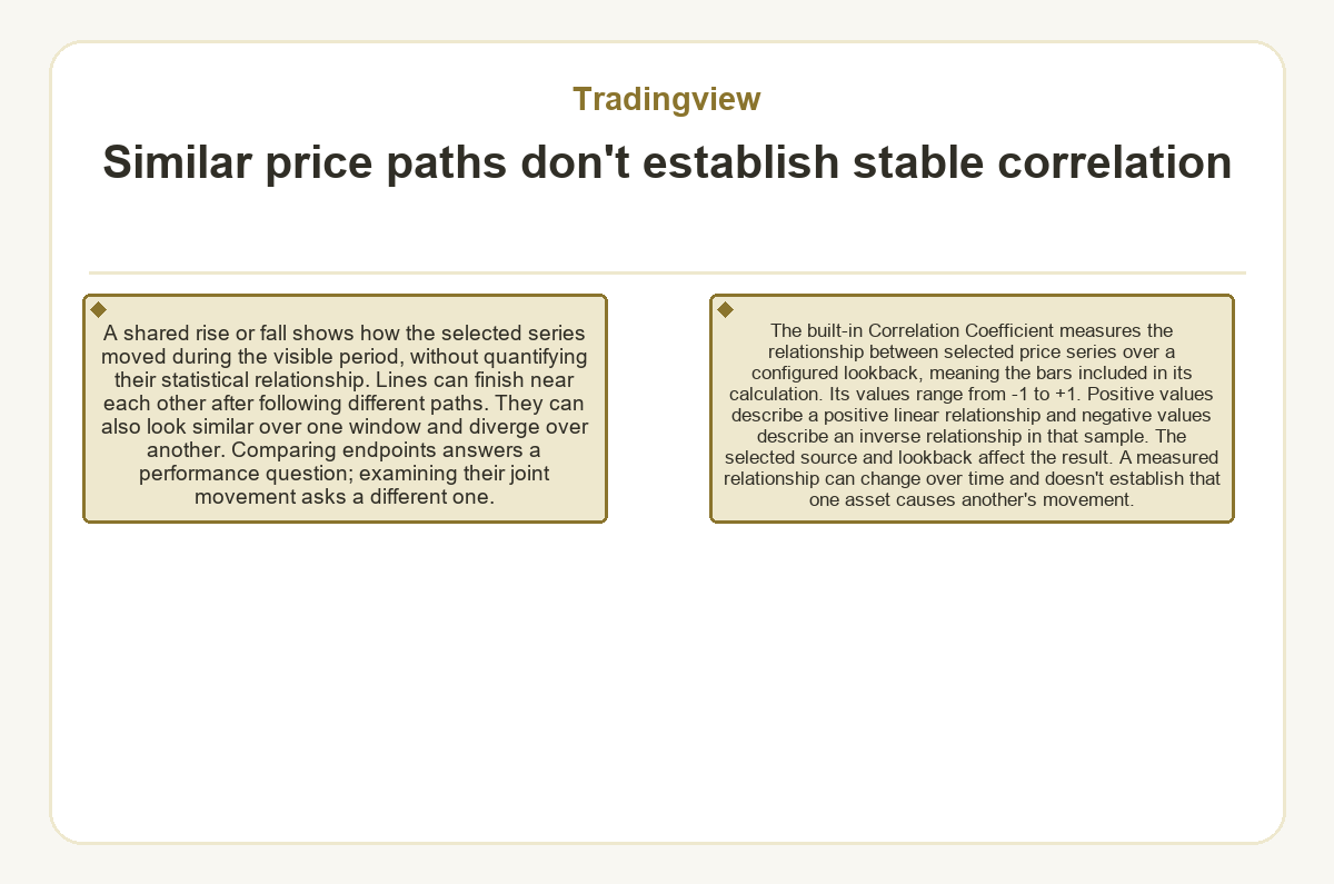
A shared rise or fall shows how the selected series moved during the visible period, without quantifying their statistical relationship. Lines can finish near each other after following different paths. They can also look similar over one window and diverge over another. Comparing endpoints answers a performance question; examining their joint movement asks a different one.
The built-in Correlation Coefficient measures the relationship between selected price series over a configured lookback, meaning the bars included in its calculation. Its values range from -1 to +1. Positive values describe a positive linear relationship and negative values describe an inverse relationship in that sample. The selected source and lookback affect the result. A measured relationship can change over time and doesn't establish that one asset causes another's movement.
Ratios measure relationships that overlays leave separate
Dividing one symbol's price by another creates a single ratio series in a spread chart. Symbol Search accepts arithmetic expressions for these calculated charts. Compare keeps the component series visible separately; a ratio follows their relationship as one value.
A rising ratio means the numerator increased relative to the denominator at the matched observations. Both underlying prices could still be falling. When both prices use the same quote asset, that pricing unit cancels in the division. With different quote assets, the ratio retains a currency-unit relationship that needs interpretation. Subtracting comparable prices instead measures an absolute difference, which is another calculation with different units.
An expression produces an analytical series, not proof that its combined instrument exists as a directly traded market. Its interpretation follows the component symbols and arithmetic. A percentage gap between two overlays also isn't the percentage change of their price ratio; each calculation uses a different denominator.
Readable overlays need visible identities and usable scales
Distinct line colors and visible symbol labels help keep each market identifiable when paths overlap. A shared regular price scale can flatten series whose nominal values are far apart. Percentage or indexed scaling addresses that display problem; separate regular price scales preserve raw units. Scale attachment also matters, because series on different axes can move independently on screen. Extra lines add context only while their identities and changes remain readable. A short comparison list leaves more space for the relationship under examination.
The next view should answer the remaining question
A crypto screener can narrow a market list before chart comparison, while price alerts monitor selected conditions over time. Neither task replaces the overlay's view of relative movement across chosen dates. Keep the question specific: asset performance in a common quote, differences between market products or the behavior of a calculated relationship.
If the remaining question concerns a quoted price level, a regular price chart preserves those units. If it concerns relative performance, retain a common baseline and comparable observations. A ratio suits the changing proportion between two series. The next display choice follows that unanswered question, including any difference in quote assets or feed construction that affects its meaning.
Useful questions about Tradingview
Can I read the original crypto price while using a percentage overlay?
You can retain price information while the chart's vertical axis uses percentages. The symbol's status line can display chart values, and price-label settings can show price alongside percentage information. Keep the selected symbol and bar clear when reading those values. A price quote and its normalized percentage describe the same series in different units.
Do I need Pine Script to overlay crypto pairs?
The built-in Compare tool overlays symbols without a Pine Script program. Its toolbar control adds another market series to the chart. Custom code becomes relevant when the intended calculation goes beyond displaying the available series and scale modes. A normal crypto price overlay doesn't require downloading an indicator installer or executing a command on your computer.
Will a crypto percentage overlay include staking rewards or trading fees?
A price overlay measures changes in the selected quoted prices, so it doesn't include your staking rewards or trading fees. It also doesn't know your holdings, entry prices or transaction history. Those inputs belong to a separate return calculation. The percentage shown for a market series therefore shouldn't serve as the net return on a personal crypto position.
How can I save a crypto comparison setup for later?
Save the chart layout to retain its configured workspace and settings. Layout management includes manual saving and an Autosave option, and layouts retain applied indicators. Preserve the compared symbols and scale choices in that workspace. Reopening a saved setup doesn't freeze incoming market prices, so record the visible date range when you need to reproduce an earlier comparison.
Should a calculated crypto ratio look identical after a chart refresh?
A calculated spread or ratio can display different bars after a refresh. Real-time spread bars use tick data, while historical bars use minute data, which doesn't retain the full sequence of movements within each bar. This reconstruction can change the displayed bars. A saved intraday view can therefore differ from the chart's refreshed history.
Does adding a crypto comparison place an order?
Adding a comparison adds a market-data series to the chart and doesn't place an order. It creates no crypto holding and doesn't transfer funds between the displayed markets. Live execution requires a separate order through a supported trading connection. The visibility of a pair in Compare establishes chart availability, not permission to trade it through a connected account.